Race Analysis
Cumulative Gap Chart
How to read the gap chart and what it tells you about your race dynamics.
What the chart shows
The gap chart plots your cumulative time gap to the race leader at each control. The X-axis is the control sequence, the Y-axis is seconds behind the leader.
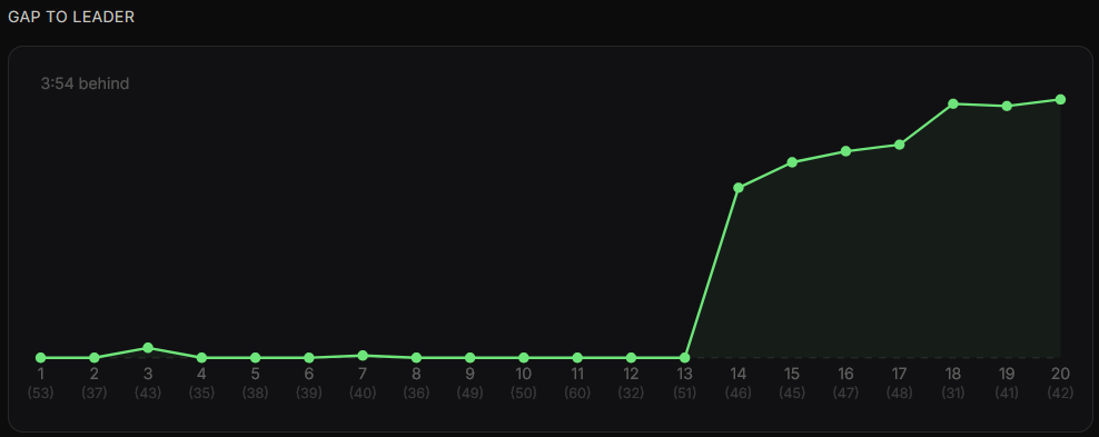
Interpreting the shape
- Steep upward jump — you lost significant time on that leg (error or hesitation)
- Flat line — you were running at roughly the same pace as the leader
- Slight downward slope — you were actually faster than the leader on that leg
Look for the steepest jumps — these correspond to your biggest mistakes or slowest legs. Cross-referencing with the color coding in the control table gives you the clearest picture.